Art & Design
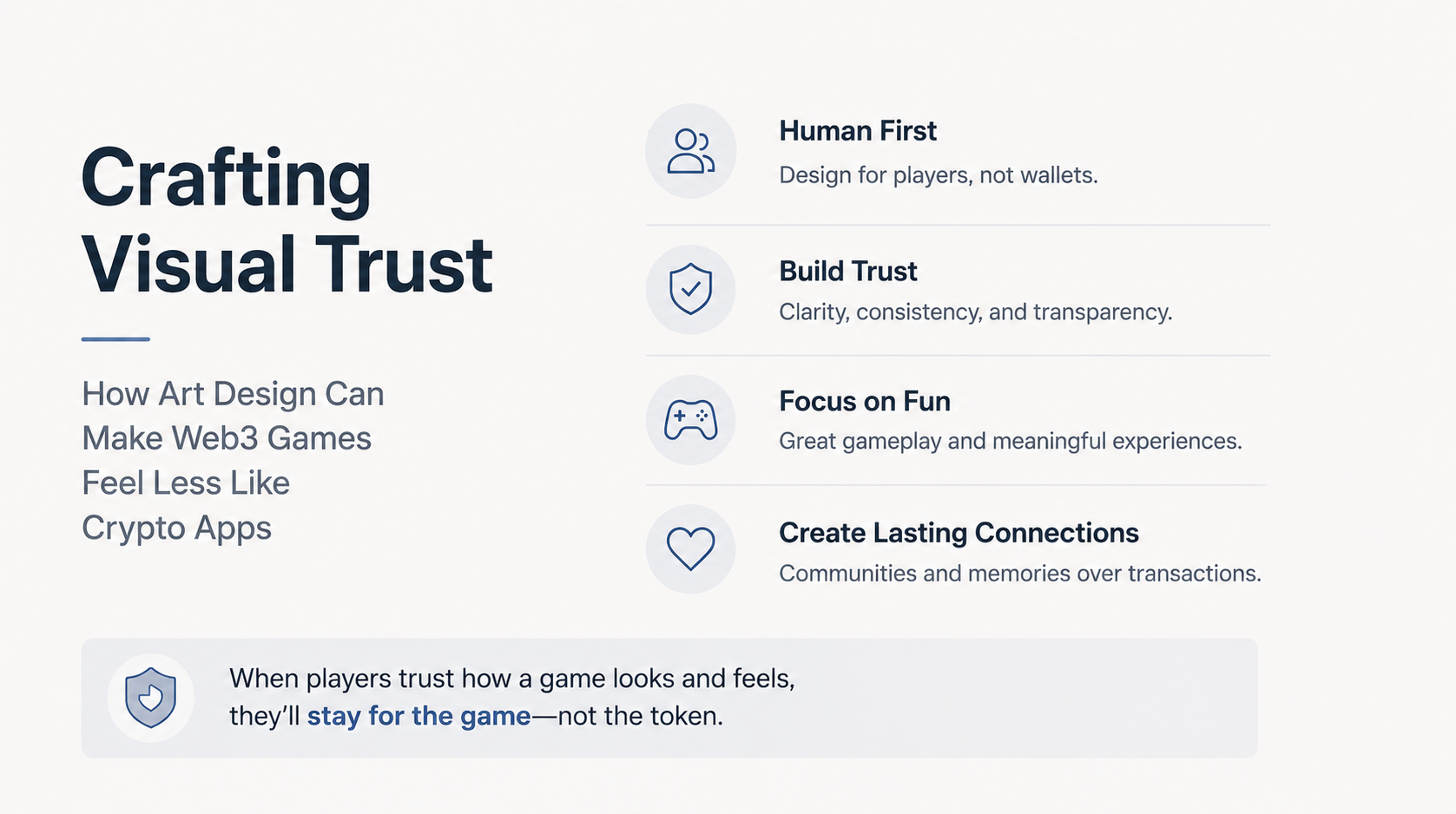
Crafting Visual Trust: How Art Design Can Make Web3 Games Feel Less Like Crypto Apps
June 15, 2026 / Orion's Gate Team
Discover how Web3 game art and UI design can build player trust by replacing crypto-heavy visuals with familiar game aesthetics, clear onboarding, readable rewards, and emotionally warm interfaces.
Why Visual Trust Matters in Web3 Games
For many players, the first impression of a Web3 game is not the combat, the world, or the story. It is the interface.
A wallet pop-up, a seed phrase warning, a token price chart, or a marketplace-style asset page can instantly make a game feel less like entertainment and more like a financial app. That perception matters. Blockchain gaming has grown significantly, with DappRadar reporting strong activity across the sector in 2024, but the industry still faces the challenge of turning curious users into long-term players [1].
This is where visual trust becomes a core art and design discipline.
Visual trust is the feeling that a game is safe, understandable, enjoyable, and made for players first. It is created through color, typography, iconography, onboarding screens, reward presentation, character design, and UI hierarchy. In Web3 games, visual trust can be the difference between “I want to play this” and “I do not understand what I am being asked to sign.”
Replace Finance-Coded Design With Game-Coded Design
A common mistake in Web3 game interfaces is borrowing too much from crypto dashboards: dark panels, dense numbers, token symbols, exchange-style charts, and wallet-first language. These elements may feel familiar to crypto-native users, but they can intimidate mainstream players.
A game should visually communicate play, not speculation.
Instead of leading with “connect wallet,” lead with a character, a world, a goal, or a moment of action. Modern onboarding tools like Immutable Passport and Sequence Embedded Wallets are designed to make sign-in feel closer to familiar gaming accounts, reducing the need to expose players to complex wallet mechanics immediately [2][3].
Design takeaway: Make the first screen feel like a game launcher, not a trading terminal. Use hero art, character portraits, world previews, and clear play buttons before introducing ownership or marketplace features.
Use Warm UI to Reduce Cognitive Friction
Trust is not only about security. It is also about emotional comfort.
Soft panels, friendly illustration, readable spacing, and clear microcopy can make Web3 actions feel less intimidating. A player who sees a clean confirmation screen with a recognizable item image, simple wording, and a clear result is more likely to continue than someone shown a technical transaction prompt full of abbreviations.
This is especially important because deceptive or confusing interface patterns can damage user trust. UX research warns that manipulative design choices can create short-term conversion but long-term distrust [4][5].
Design takeaway: When a player claims a reward, mints an item, trades a cosmetic, or confirms ownership, the UI should answer three questions visually:
What am I getting?
What am I giving?
What happens next?
If the screen cannot answer those questions in five seconds, the design needs simplification.
Make Ownership Feel Emotional, Not Technical
Web3's unique value is ownership, but ownership should not be presented only as a contract, token ID, or wallet address. In games, ownership should feel personal.
A sword can show its history through engraved marks. A skin can show its season through fabric patterns. A pet can carry a small badge from the event where it was earned. A player house can display crafted objects as memories rather than “assets.”
This turns blockchain data into visual storytelling.
Instead of saying “NFT metadata updated,” show the player's item gaining a new ribbon, stamp, glow, or maker's mark. Instead of showing a raw transaction, show a short celebration animation: the item lands in the inventory, the character reacts, and the reward becomes part of the world.
Design takeaway: Translate ownership into art language: badges, scars, decals, stamps, engravings, signatures, trophies, and environmental display.
Build Trust Through Consistent Iconography
Web3 games often include actions that traditional games do not: claim, stake, bridge, mint, verify, sign, list, rent, transfer, and craft on-chain. If each action uses inconsistent icons or vague labels, the player's confidence drops.
A trusted game UI needs a consistent icon system.
For example:
“Claim” should feel like receiving a reward.
“Trade” should feel like an exchange between players.
“Verify” should feel like safety and confirmation.
“Transfer” should feel directional and final.
“Mint” should feel like creation, not financial risk.
The key is to avoid crypto-native symbols unless the audience already understands them. Use game metaphors instead: chests, seals, tickets, crafting hammers, delivery arrows, guild stamps, and item cards.
Design takeaway: Create a Web3 action icon sheet inside the art bible. Every blockchain-related action should have a friendly game-world metaphor.
Design Marketplaces Like Boutiques, Not Exchanges
Marketplace design is one of the biggest trust challenges in Web3 games. If the marketplace looks like a price board, it encourages speculation. If it looks like a curated shop, it encourages discovery, identity, and collection.
A better Web3 marketplace should feel like an in-game boutique:
large item previews
character try-on views
rarity explained with shape and material, not just color
creator or season labels
clear ownership status
no overwhelming token clutter
This approach is especially important as more Web3 games experiment with player-created content and creator economies. Games such as Shrapnel have positioned creator tools and marketplaces as central parts of their experience, making visual curation essential [6].
Design takeaway: Treat marketplace assets like fashion, collectibles, or crafted gear. The layout should sell identity and play value before financial value.
Use Color to Signal Safety and Clarity
Color is a powerful trust signal. Red can imply danger, yellow can imply caution, green can imply success, and blue can imply security. But Web3 games must be careful not to rely on color alone, especially for accessibility. Accessibility guidance recommends using labels, icons, and contrast in addition to color to communicate important states [7][8].
For example, a transaction confirmation should not only turn green when complete. It should also show a checkmark, a short success message, and the item now visible in the player's inventory.
Design takeaway: Build a trust palette:
Blue or neutral tones for account/security areas
Green plus checkmark for completed actions
Yellow plus icon for review-needed moments
Red plus clear warning text for irreversible actions
Good trust design is calm, not loud.
Hide Complexity, But Never Hide Consequences
The best Web3 game design reduces technical complexity, but it should not hide meaningful consequences. Players do not need to see every blockchain detail all the time, but they do need to understand when an action is permanent, paid, public, tradable, or irreversible.
This is the balance: make the interface simple, not vague.
A visually trustworthy confirmation screen should include:
item image
action name
cost or fee, if any
destination or recipient
permanence warning, if relevant
clear confirm and cancel buttons
This avoids the feeling that the game is tricking the player. Trust grows when players feel informed, not overwhelmed.
Final Thoughts: Trust Is an Art Direction Choice
Web3 games will not win mainstream players by looking more like crypto apps. They will win by looking like great games: warm, readable, polished, emotionally rewarding, and visually honest.
Art design has a major role to play. Friendly onboarding, clear iconography, boutique-style marketplaces, visual ownership cues, accessible color systems, and calm confirmation screens can make blockchain features feel natural instead of intimidating.
The future of Web3 game design is not about hiding Web3 completely. It is about presenting it through the language of play.
When a player thinks, “I understand this, I trust this, and I want to keep playing,” the art direction is doing its job.
References
DappRadar — “DappRadar Games Report – 2024 Overview.”
Immutable — “Passport,” official product page.
Sequence — “Sequence Embedded Wallets: The easiest way to onboard players into Web3.”
Nielsen Norman Group — “Deceptive Patterns in UX: How to Recognize and Avoid Them.”
Mathur, Mayer, Kshirsagar — “What Makes a Dark Pattern… Dark?”
Shrapnel — Official marketplace and creator ecosystem positioning.
Section508.gov — “Making Color Usage Accessible.”
W3C Web Accessibility Initiative — WCAG contrast and visual accessibility guidance.