Art & Design
Neo-Noir 2.0: How Modern Neon, High Contrast, and Film-Grain Texture Are Shaping Game Art Trends
May 4, 2026 / Orion's Gate Team
Neo-Noir is back-rebuilt for modern engines. Learn how today's neon noir game art uses high-contrast lighting, wet-surface reflections, cinematic color scripts, and carefully tuned film grain to create worlds that look incredible in motion and in screenshots. Includes practical art-direction rules and references.
Neo-Noir 2.0 is not “just neon”
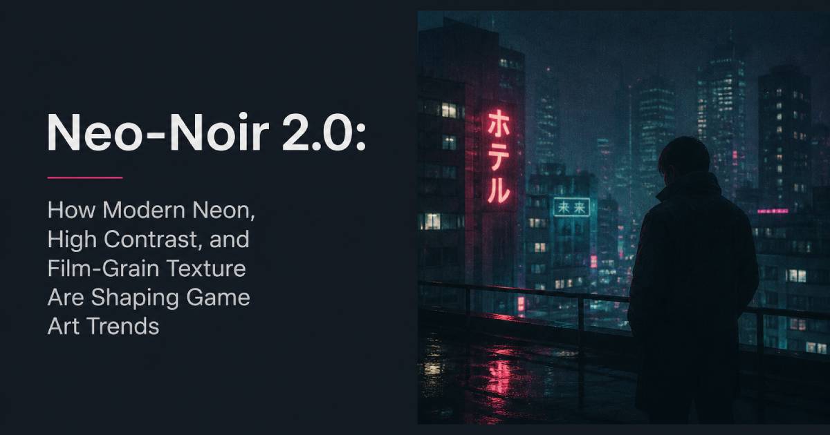
Classic noir vibes were built on shadows, silhouettes, and moral ambiguity. Neo-Noir 2.0 keeps that DNA, but updates the visual language with modern tools: volumetrics, emissive signage, reflective rain, and film-like texture that makes digital scenes feel photographed instead of rendered.
You can see this “light-first” design mindset in recent breakdowns of Alan Wake 2, where lighting isn't treated as a final pass-it's the organizing principle that guides mood, composition, and story beats throughout scenes.[1] And on the cyberpunk side, studios like Neon Giant have talked about building The Ascent's world with deliberate constraints and pipelines that support a dense, stylized environment language.[2][3]
The result is a recognizable trend: high contrast + neon accents + cinematic texture-worlds that feel like playable film frames.
The Neo-Noir 2.0 look: a quick definition
A modern neon noir art direction usually combines:
A deep shadow base (big value blocks, not noisy midtones)
Neon as punctuation (small but intense emissive highlights)
Wet surfaces and glow interaction (rain, puddles, specular streaks)
Cinematic post (film grain, subtle bloom, controlled depth of field)
Graphic silhouettes (characters and props readable in 1 second)
If you're building a blog-ready, SEO-friendly mental model, think of it as:
“Shadow architecture + neon wayfinding + film texture.”
1) Color scripting: contrast first, neon second
The most common mistake: turning the entire scene into a rainbow of emissives. Neo-Noir 2.0 works because neon is rare.
Rules to steal
Reserve neon for navigation and emotion: signs, doors, enemies, key interactables.
Limit the palette per district: one dominant hue (e.g., cyan) + one rival hue (e.g., magenta) + neutral shadows.
Protect your blacks: keep large regions of near-black so neon can “spark.”
This is why cinematic pixel-noir projects like REPLACED market their look as “best-in-class pixel art enhanced by modern depth-of-field, lighting, and cinematic visual effects”-the pitch is literally about old-school readability plus modern cinematic control.[4]
2) Lighting as composition: build scenes around the beam
In Neo-Noir 2.0, lighting is a level-design tool. Strong art direction uses light to stage the player:
Key light for the subject (player, threat, objective)
Rim light to carve silhouettes from darkness
Practical lights (lamps, signs) that feel grounded in-world
Negative fill to keep shadows heavy instead of “gamey gray”
That “light writes the scene” approach is central to how Alan Wake 2 is discussed in lighting-focused analysis.[1] You're not decorating a finished environment-you're designing a shot the player can move through.
3) Wetness and reflections: the neon multiplier
If you want neon to feel expensive, give it surfaces to bounce on.
Production-friendly tricks
Use wetness masks on sidewalks, building edges, trash bags, jackets.
Add thin reflection streaks on puddles-don't mirror the whole sign.
Keep reflection blur physically plausible (roughness variance is your friend).
This is one reason The Ascent reads as “city at night” even in busy top-down scenes: dense signage and surface response create a constant interplay of glow, steam, and reflections.[2][3]
4) Film grain: texture with a purpose (not “random noise”)
Film grain is controversial, but it's trending because it solves a real art problem: perfect digital clarity can feel sterile. Light grain can unify gradients, soften banding, and make neon glow feel more like a camera capture.
Players and press regularly discuss grain as a “setting you can turn off,” which is exactly why you should design it intentionally-subtle, scalable, and never smearing UI. Mainstream graphics-setting guides repeatedly list film grain among effects players often disable, so heavy-handed implementations can backfire.[5]
Grain done right
Apply grain after color grade, but before UI (or mask UI out).
Tie grain strength to exposure (more visible in shadows, less in highlights).
Keep it subtle at default; provide a slider.
5) The new hybrid: “Pixel Noir” meets modern cinema
One of the most interesting 2025-2026 art trends is neo-noir cinematography applied to pixel art-a style mash-up that feels both nostalgic and premium.
REPLACED is a clean example: it sells a 2.5D pixel-art world explicitly enhanced by depth-of-field, lighting, and cinematic post.[4] Major outlets describe its setting in terms that match the neon-noir template-“neon lights flicker over rain-soaked streets,” industrial decay, shadows, and secrets.[6]
This hybrid is powerful for social sharing because pixel silhouettes stay readable on small screens, while cinematic lighting adds “film frame” prestige.
6) UI and signage: make neon functional
Neo-Noir 2.0 is at its best when signage isn't just decoration-it's wayfinding.
Design patterns
Color-coded districts: cyan = commerce, red = danger, amber = transit
Animated sign cadence: slow flicker for mood, fast pulse for urgency
Diegetic prompts: hologram labels, projected arrows, map kiosks
This keeps the aesthetic coherent while reducing player frustration in dark environments.
Closing: why Neo-Noir 2.0 keeps winning
Neo-Noir 2.0 is climbing because it's a perfect match for how games are discovered now. High contrast reads on phones. Neon creates instant mood. Film-like texture makes scenes feel “shot,” not “simulated.” And when done with discipline, the look stays premium across trailers, streams, and screenshots.
It's not about throwing neon on everything.
It's about designing darkness-then letting light speak.
References
Designooor — “From Neon to Candlelight: The Lighting Logic of Alan Wake 2.”[1]
80.lv — “Neon Giant Talked about Building the World of The Ascent.”
80.lv — “The Secrets of Game Design in The Ascent.”
Steam Store — REPLACED description (2.5D pixel art enhanced by depth-of-field, lighting, cinematic VFX).
SlashGear — “PC Video Game Graphics Settings You Can Turn Off…” (includes film grain among commonly disabled post effects).
Engadget — “Pixel-art cyberpunk game REPLACED arrives in March…” (neon lights, rain-soaked streets, noir tone).